Facebook Instruction Manual

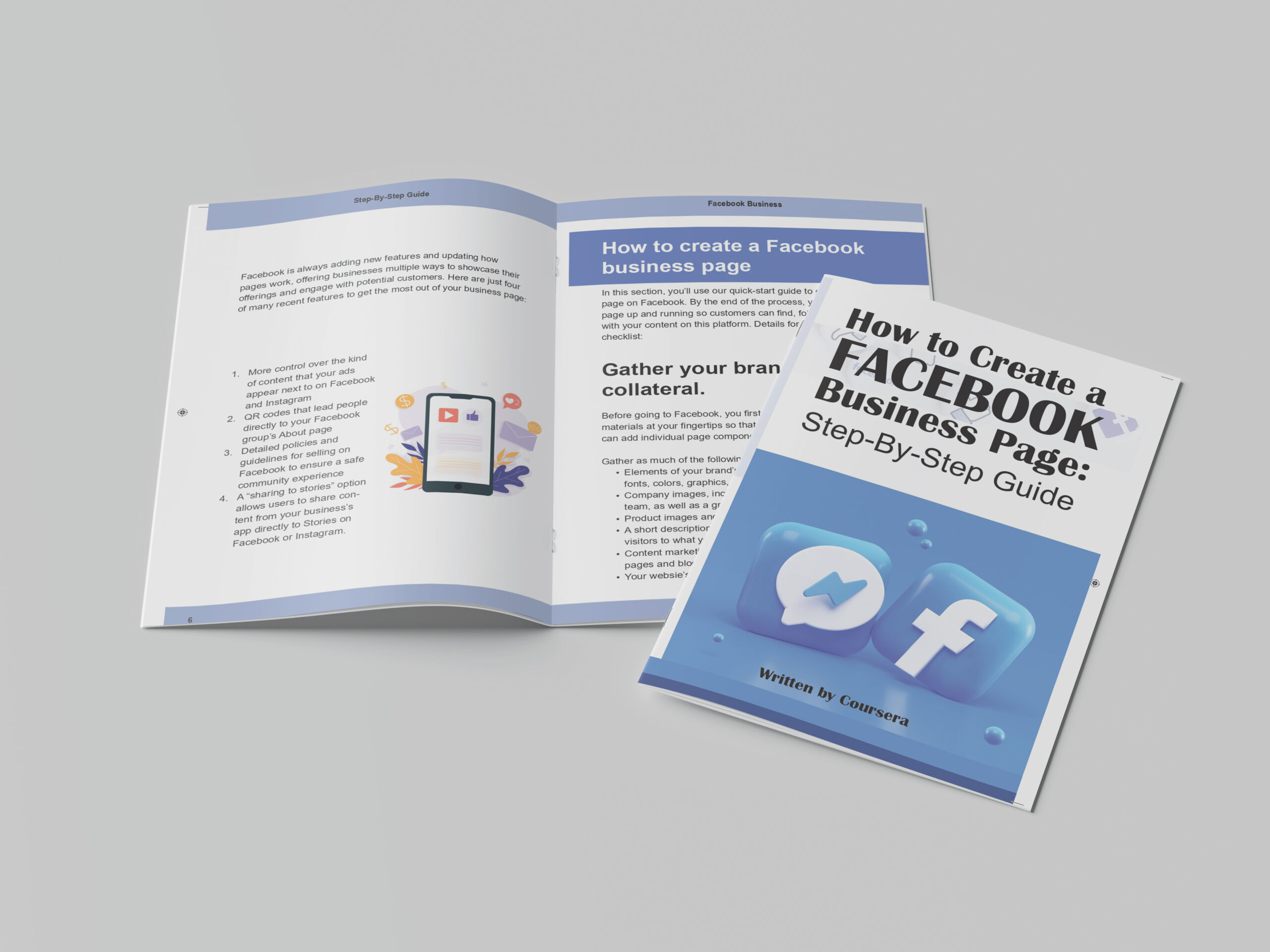
For this print design project, we were tasked with creating a Facebook instruction manual using only the provided text. I designed the manual from start to finish in Adobe InDesign, focusing on clarity, structure, and ease of navigation.
To align with Facebook’s brand identity, I used their signature colors—blue, white, and gray—and incorporated them into the design for consistency and familiarity. I paid close attention to creating a clean, organized layout with well-aligned headings, bullet points, and sections to ensure that the instructions were easy to follow and visually accessible.
The goal was to design a user-friendly manual that wasn’t overwhelming or confusing. I used strategic typography, spacing, and alignment to improve readability and make the information intuitive for users. This attention to design ensured that the manual felt professional while prioritizing functionality.
Through this project, I enhanced my skills in Adobe InDesign, learned the importance of visual hierarchy, and gained a better understanding of how design can improve user experiences by making information clear and simple to follow.


