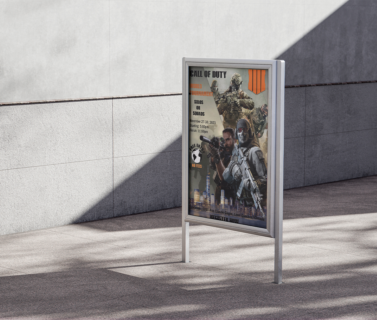
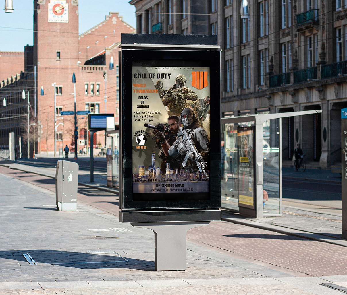
Exhibit Display
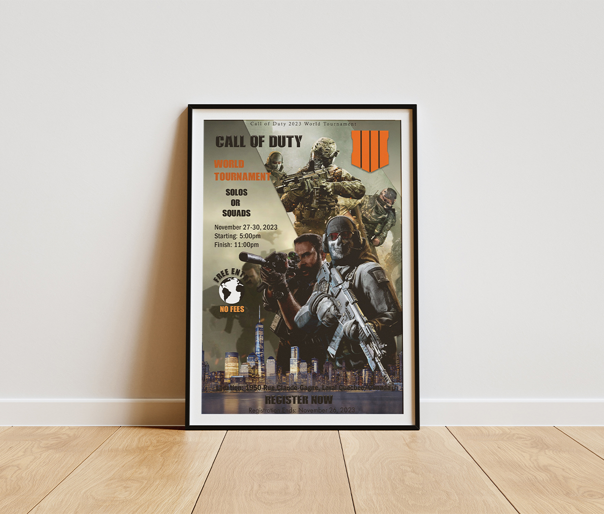
The exhibit display for the Call of Duty event tournament, created using Adobe Photoshop and Illustrator, likely aimed for a high-impact visual that immediately conveys the energy of the game. The design process would have started by selecting key visual elements from the Call of Duty universe, such as soldiers and weaponry, which were then manipulated and combined in Photoshop to create a dynamic and engaging composition. This could involve layering images, applying effects to enhance the sense of action, and ensuring a visually striking focal point.
Illustrator would have been essential for crafting the typography and any vector-based graphics. The text elements, including the tournament name, dates, location, and call to action, would have been designed using bold, easily readable fonts that align with the militaristic theme of Call of Duty. Careful attention would have been paid to the hierarchy of information, ensuring that the most important details stand out. Illustrator’s capabilities allow for scalable graphics, ensuring that text and logos appear crisp and clear at any size on the exhibit display.
The choice of colors would have played a crucial role in establishing the overall mood and attracting attention. Drawing inspiration from the game’s aesthetic, the palette likely incorporated a mix of darker, more serious tones with brighter accent colors to create contrast and highlight key information. For instance, the orange from the logo in the promotional material could have been integrated to reinforce branding and draw the viewer’s eye to registration details or the tournament name. The combination of these design elements in Photoshop and Illustrator would have resulted in a visually compelling and informative exhibit display.