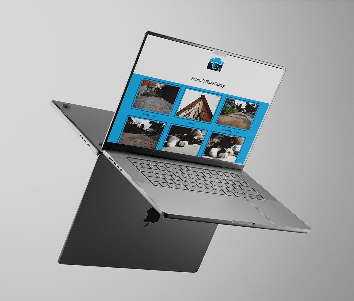
Responsive Photo Gallery Website
This responsive Photo Gallery Website project was an exploration focused on understanding CSS grids and flexbox to strengthen coding skills and learn the foundations of responsive design. The goal was to create a visually appealing, functional photo gallery that adapts across different screen sizes, helping to solidify core coding concepts.
Throughout this project, I learned how to effectively implement CSS grids and flexbox layouts to create responsive designs. I also gained experience using Visual Studio Code and Adobe Dreamweaver for coding and building the website. Additionally, I explored the browser’s inspect tool to troubleshoot and optimize designs in real time, gaining insight into how layouts behave across different devices and resolutions.
The key takeaway from this project was developing a deeper understanding of how grids and flexbox interact, mastering tools for responsive design, and learning how to troubleshoot and debug designs using browser inspection tools. This project was essential for improving my coding confidence and problem-solving skills.
